Using Grid Systems to Structure Your Layouts
Grid systems form the backbone of many modern layouts, providing a invisible framework that brings order to visual content. By dividing a page into columns, rows, and modules, designers can place elements with precision and predictability. This approach reduces ambiguity in layout decisions and helps maintain visual cohesion across different pages or screen sizes. Understanding how grids work, and how to adapt them to various contexts, is a fundamental skill for anyone involved in constructing interfaces or publications.
The concept of using a grid is not new. From early manuscript layouts to modern responsive web design, the underlying principle remains the same: align elements along a structured set of guides. What changes over time are the tools, the flexibility of the grid, and the variety of applications. Today, designers have access to both predefined grid frameworks and custom solutions that can be adjusted to specific project needs. The focus of this article is on the core components—column grids, modular scales, and alignment techniques—and how they contribute to consistent, coherent layouts across different devices and viewports.
Throughout the discussion, emphasis is placed on the process of setting up and using grids, rather than on claiming any particular outcome. The effectiveness of a grid depends on many factors, including the content being arranged, the target audience, and the overall design context. By exploring the principles behind grids, readers can gain a clearer understanding of how to apply them in their own work, while remaining aware of the constraints and possibilities each system offers.
The Fundamentals of Grid Systems
A grid system is essentially a set of guides that define the horizontal and vertical divisions of a layout. These divisions create fields or modules where content can be placed. The most common types include column grids, modular grids, and hierarchical grids. Column grids use vertical columns as the primary structuring element—content typically spans one or more columns, with consistent gutters (spaces between columns) to ensure visual breathing room. Modular grids, on the other hand, combine both columns and rows, forming a matrix of cells that can be used to arrange smaller elements like images and text blocks. Hierarchical grids are less rigid; they are based on the proportional relationships between elements rather than strict equal divisions.
Choosing a grid type depends on the nature of the content and the desired layout rhythm. For example, a text-heavy publication might benefit from a simple single-column or two-column grid, while a gallery or dashboard often requires a modular grid to accommodate varied media. Regardless of the type, the purpose of the grid is to provide a consistent structure that helps users navigate the content without visual chaos. The grid acts as a silent organizer, making the reading or browsing experience more predictable and comfortable.
When planning a grid, designers typically decide on the number of columns, the column width, and the gutter width. These parameters determine the overall horizontal rhythm. Vertical spacing can also be controlled through baseline grids or row heights, especially in modular systems. The key is to establish a set of rules that apply across all pages or screens. This consistency reduces cognitive load for the audience, as they quickly learn where to find information and how elements relate to one another.
Column Grids: Structure and Flexibility
Column grids are perhaps the most widely used grid system, especially in web and print design. They consist of a set number of vertical columns separated by gutters. Content elements—such as text blocks, images, and buttons—are placed within these columns or across multiple columns. The flexibility of a column grid comes from the ability to combine columns. For instance, a 12-column grid allows for a wide range of layout variations: a two-column layout can be created by combining six columns each, while a three-column layout uses four columns each. This modularity makes column grids highly adaptable to different content hierarchies.
The choice of column count often depends on the complexity of the layout. Common choices include 12, 8, 6, or 4 columns. A higher column count provides more granular control, but can also lead to excessive fragmentation if not used carefully. Consistency in column usage helps maintain a visual rhythm. For example, if a heading spans the full width, followed by a two-column body, the transition feels natural because the column structure remains constant. Alignment along the vertical edges of columns creates strong left and right boundaries, which improves readability and creates a sense of order.
Gutters play a crucial role in column grids by preventing elements from touching each other too closely. The gutter width should be proportional to the overall design, typically ranging from 12 to 20 pixels on digital screens. Too narrow a gutter causes content to feel cramped, while too wide a gutter breaks the visual connection between columns. Setting consistent gutter widths across all instances is part of the grid discipline. Many design tools and CSS frameworks allow designers to define these parameters globally, ensuring that every page adheres to the same spatial rules.
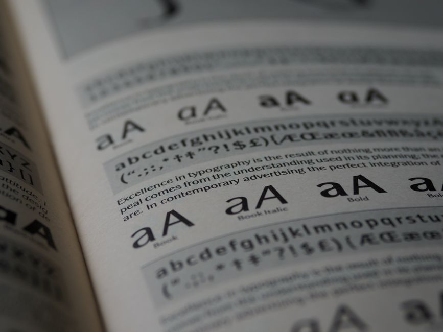
Modular Scales for Consistent Proportion
While column grids handle horizontal structure, modular scales address the vertical and proportional relationships between elements. A modular scale is a sequence of numbers that relate to one another by a ratio—such as the golden ratio (1.618), a minor third (1.2), or a perfect fifth (1.5). These ratios are applied to font sizes, spacing, and dimensions of elements to create visual harmony. For instance, if the base font size is 16 pixels and the ratio is 1.25, the next size up would be 20 pixels, then 25, and so on. Using such a scale means that all sizes in the layout feel connected, rather than random.
Modular scales can be combined with grid systems to enhance consistency. A column grid provides the horizontal framework, while the modular scale determines vertical rhythms like line heights, padding, and margin sizes. When both systems work together, the layout feels cohesive and predictable. Designers often set a base measurement—such as the gutter width or a baseline grid increment—that aligns with the modular scale. This integration ensures that every spacing decision, from the gap between paragraphs to the height of a button, follows a logical progression.
Choosing the right scale ratio requires consideration of the content type and reading experience. Smaller ratios (e.g., 1.2) produce subtle changes, suitable for dense text layouts. Larger ratios (e.g., 1.618) create dramatic contrast, often used for headlines and hero sections. The scale must also be tested with actual content to ensure that the resulting sizes remain legible and visually balanced. There is no single correct scale; the goal is to establish a consistent proportioning system that supports the layout’s purpose.
Alignment Techniques and Visual Harmony
Alignment is the practice of placing elements so that their edges line up with the grid guides. Proper alignment reduces visual noise and creates a clean, professional appearance. In grid-based layouts, alignment typically follows the column boundaries and the top and bottom edges of the grid rows. For example, text should align to the left (or right, depending on language direction) of a column, and images should snap to the grid lines. This discipline introduces a sense of order that allows the content to breathe.
Beyond basic left/right alignment, designers also consider vertical alignment. Items within a row or section should be aligned to a common baseline or to the top of the grid cell. In modular grids, elements like cards or thumbnails often have consistent heights that align with the row increments. This creates a rhythmic pattern that guides the eye across the layout. Contrast this with a layout where every element has different vertical positioning; the viewer must constantly adjust their focus, leading to a disjointed experience.
Another subtle but important alignment technique is optical alignment. Sometimes a purely mathematical grid alignment can appear visually off, especially with curved shapes or descending letters. Designers may need to nudge elements slightly to achieve a sense of balance. This is not a violation of the grid but a refinement. The grid serves as a starting point, not a rigid cage. Knowing when to bend the rules comes from experience and careful observation. The goal is to achieve harmony—where elements feel connected without being forced into unnatural positions.
Adapting Grids for Different Screen Sizes
One of the greatest challenges in modern layout design is ensuring that grids work across a wide range of screen sizes, from small smartphones to large desktop monitors. Responsive design approaches address this by adjusting the grid structure based on viewport width. A common technique is to use a fluid grid, where column widths are expressed in percentages rather than fixed pixels. As the screen size changes, columns resize proportionally, and gutters may also scale or remain fixed within a range.
Breakpoints are used to change the column count at specific widths. For example, a layout might use 12 columns on large screens, 8 columns on medium screens, and 4 columns on small screens. Content then reflows into the available columns. This requires careful planning of how elements will collapse or stack. Designers often use a mobile-first approach, starting with a simpler single-column grid for small screens and progressively adding complexity for larger screens. The grid system provides a consistent framework, but the specific arrangement of content may vary.
Another factor is the baseline grid for vertical rhythm. On different screens, line heights and spacing should remain proportionally consistent. Using relative units like ems or rems for spacing helps maintain vertical harmony when font sizes scale. Some grid systems include a baseline grid that aligns all text to a common invisible line, ensuring that lines of text across different columns stay vertically aligned. While this is easier to achieve in print, digital layouts can approximate it by setting line heights that are multiples of a base increment. The adaptability of grids across devices is not automatic; it requires testing and adjustment to ensure that the visual structure remains functional and pleasing at every size.
Implementing Grids in Practice
Implementing a grid system can be done through various means, depending on the medium. For print design, grid guides are set in layout software like Adobe InDesign or Affinity Publisher. Designers create master pages with predefined margins, columns, and baseline grids. These guides help maintain consistency across multiple pages. For web design, CSS grid and flexbox are the primary tools for creating grid-based layouts. CSS Grid Layout provides explicit control over columns and rows, while flexbox offers one-dimensional flexibility. Many front-end frameworks, such as Bootstrap or Foundation, include pre-built grid systems that can be customized.
The process typically begins with establishing the grid parameters: number of columns, column width, gutter width, and margins. For responsive layouts, breakpoints are defined. Then, content is placed within the grid, using alignment and spacing rules derived from the modular scale. Prototyping and testing are essential steps to verify that the grid works with actual content. Adjustments may be needed to accommodate longer text, smaller images, or different aspect ratios. The grid is a tool, not a straightjacket; it should support the content rather than force it into unnatural shapes.
Documentation of the grid system within a design system or style guide helps teams apply it consistently. This documentation typically includes visual examples, code snippets, and usage rules. Over time, maintaining the grid discipline becomes a shared practice that streamlines collaboration and reduces decision fatigue. While each project may have unique requirements, the underlying principles of structure, proportion, and alignment remain constants. By focusing on these principles, designers can create layouts that feel organized and cohesive, regardless of the medium or screen.