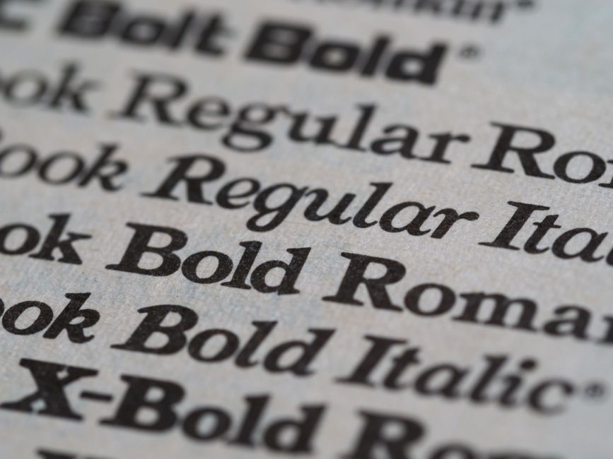
Five Classic Font Pairings for Clean Interfaces
Typography is a foundational element of interface design, influencing how users perceive content and navigate digital spaces. The choice of typefaces affects not only aesthetics but also the clarity and comfort with which information is absorbed. Among the many approaches to selecting fonts, pairing a serif with a sans-serif typeface remains a consistently effective method for achieving both contrast and harmony. This technique leverages the structural differences between the two categories to create visual interest while maintaining readability across headings and body text.
When selecting font pairings, designers often consider factors such as x-height, stroke contrast, and overall proportions. A well-matched pair balances personality without competing for attention. The goal is to establish a clear hierarchy where one typeface supports the other, guiding the reader from headlines to body copy without disruption. The following pairings illustrate classic combinations that have proven reliable for clean, user-friendly interfaces.
Helvetica and Garamond
Helvetica is a widely recognized sans-serif typeface known for its neutral, clean lines and excellent legibility at various sizes. Garamond, a classic serif typeface, brings a sense of tradition and warmth with its delicate, humanist proportions. When combined, Helvetica handles display roles such as headings and navigation elements, while Garamond is well suited for longer passages of body text. The contrast between Helvetica’s uniform strokes and Garamond’s tapered serifs creates a visually engaging rhythm without overwhelming the reader. This pairing works particularly well in interfaces that require a professional yet approachable tone, such as editorial platforms or corporate websites. Designers often adjust the weight of Helvetica to ensure headings maintain enough presence without overshadowing the serif’s subtle details. The overall effect is balanced and timeless, supporting readability across different screen sizes.
Open Sans and Merriweather
Open Sans is a humanist sans-serif typeface designed for clarity on digital screens, featuring open letterforms and generous spacing. Merriweather, a serif typeface created for readability on screens, offers slightly condensed proportions and strong contrast between thick and thin strokes. This pairing benefits from shared design intentions: both typefaces were optimized for web use, meaning they handle well at typical interface sizes. Open Sans is often applied to headings, buttons, and labels, where its neutrality ensures quick scanning. Merriweather is used for body paragraphs, where its serifs help guide the eye along lines of text. The combination works because the two typefaces maintain a similar x-height and overall temperament, creating a cohesive reading experience. This pairing is commonly seen in content-heavy applications such as blogs, news articles, and documentation sites, where legibility over extended reading sessions is important. Subtle adjustments in letter-spacing may be needed to achieve optimal alignment.
Futura and Playfair Display
Futura is a geometric sans-serif typeface characterized by its clean, circular shapes and near-perfect uniformity. Playfair Display is a high-contrast serif typeface inspired by transitional and modern designs, featuring elegant swashes and dramatic stroke variation. This pairing introduces a stronger contrast in both form and personality, making it suitable for interfaces where a distinctive visual identity is desired. Futura’s geometric precision works well for headlines and calls to action, drawing attention without relying on decorative elements. Playfair Display, when used for subheadings or accent text, adds a refined, editorial feel that can elevate the overall design. However, because of the pronounced differences, this combination requires careful attention to spacing and scale. For body text, a more neutral serif might be preferable to maintain readability. This pairing is often chosen for fashion, lifestyle, or cultural websites where the interface itself is part of the brand experience. The key is to limit Playfair to short lines or featured quotes, preserving its impact while avoiding fatigue.
Roboto and Lora
Roboto is a sans-serif typeface with a friendly, mechanical structure that balances geometric forms with humanist touches. Lora is a serif typeface with a calligraphic influence, featuring moderate contrast and robust serifs that hold up well on screens. This pairing is highly versatile and works across a wide range of digital interfaces, from dashboards to long-form articles. Roboto’s clarity and simplicity make it a strong choice for primary navigation, headings, and interface labels. Lora complements it with a slightly more organic feel in body text, providing a subtle shift in texture that helps differentiate content zones. Both typefaces share a similar overall width and moderate stroke contrast, which helps the transition between them feel natural. When combined, they support a clear hierarchy without requiring excessive typographic adjustments. This pair is especially effective in projects that prioritize accessibility and legibility, as both fonts have been tested for screen performance. Designers often use the same font weight across both typefaces for a consistent visual rhythm.
Arial and Georgia
Arial is a widely available sans-serif typeface known for its straightforward, functional design. Georgia is a serif typeface created specifically for screen readability, with large x-heights and sturdy serifs. This pairing is one of the most reliable for systems where font availability and performance are primary concerns. Arial serves well for headings and interface elements due to its neutral character and widespread support across devices. Georgia adds a touch of personality to body text without sacrificing legibility, making it a strong choice for content-rich sections. The combination works because both typefaces were designed with screen rendering in mind, ensuring consistent appearance across platforms. This pairing is often found in interface prototypes, email newsletters, and content management systems where simplicity and compatibility are valued. Although neither typeface is considered highly expressive, their restraint contributes to a clean, uncluttered interface that focuses attention on content. Adjusting line-height and paragraph spacing can further enhance readability when using this pair.
Selecting a font pairing involves understanding the context in which it will be used, the brand’s visual language, and the needs of the audience. Each of the pairings discussed offers a different balance of contrast and personality, from the subtle harmony of Open Sans and Merriweather to the more pronounced contrast of Futura and Playfair Display. The examples illustrate that effective pairings often share underlying proportions or design principles while maintaining enough difference to establish hierarchy. Designers are encouraged to test combinations across various screen sizes and reading conditions, as real-world usage often reveals nuances that static previews cannot. Ultimately, the best font pairing is one that serves the content and enhances the user’s experience without drawing unnecessary attention to itself. By focusing on readability and coherence, designers can create interfaces that communicate clearly and remain inviting to users over time.